We’re bombarded with shock headlines and talk of ‘unprecedented’ statistics, but when we take a few steps back from the charts and look at Australian property history with a broader lens, we can truly ask ourselves, “what’s changed?”
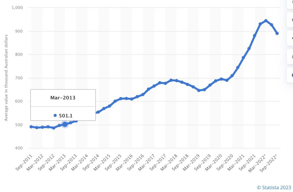
Today’s Sunday blog contrasts 2013 to today in the charts. Clearly, the most stunning change over the decade is that of property prices. Our most recent average house price in Australia (recorded in December 2022 by the Australian Bureau of Statistics) is $881,200. Note: Melbourne currently sits at $894,400.
Over one decade with three downturns, our national growth rate has averaged 5.8% growth, year on year.
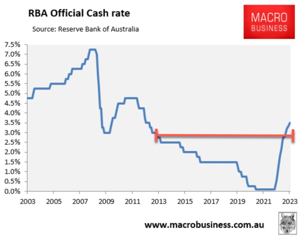
And while 2022 slammed us with consecutive interest rate increases, we have to remind ourselves that the emergency measures taken at the onset of COVID lockdowns were just that; emergency measures. Our record low interest rate was never intended to be permanent. Despite ten cash rate increases, our cash rate is still lower than the historical average, and when contrasted to a decade ago, today’s rate sits only marginally above March 2013’s 3%.
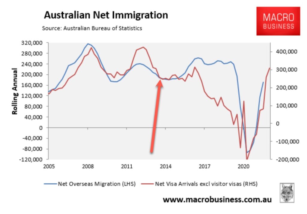
Net migration remains a strong feature story in our press, however the chart below is compelling, particularly when looking at the heights of 2008 and 2012 new arrivals.
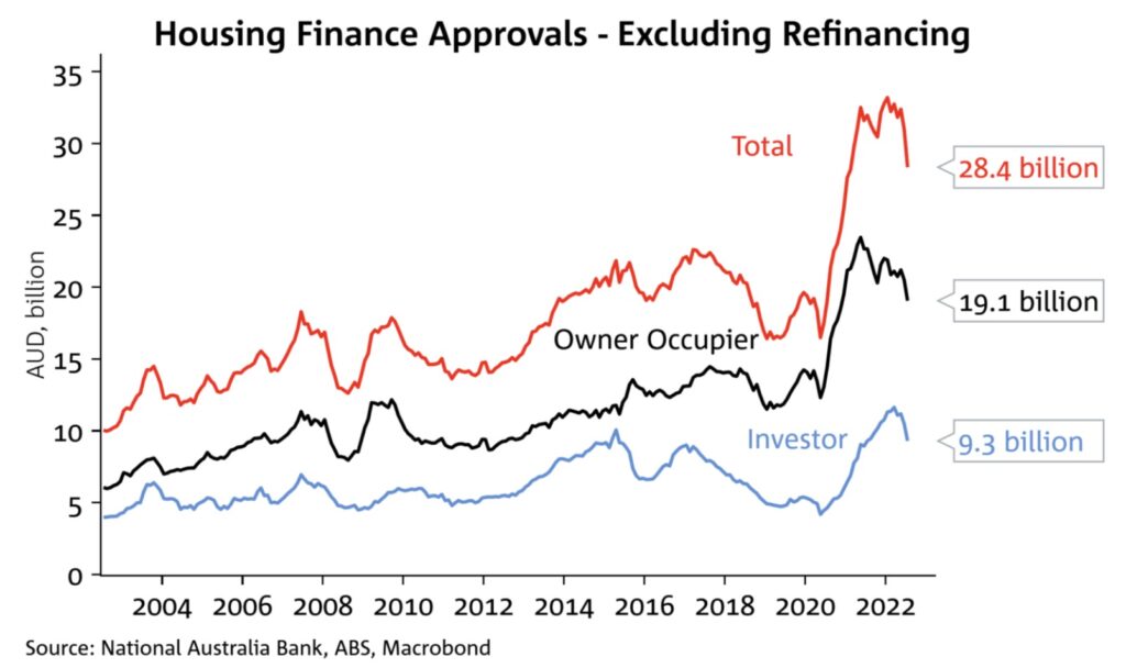
Housing finance approvals show a sharp increase post-COVID; a perfect illustration of the headiness of 2021 and 2022 as households took advantage of record low interest rates and initiated change with their homes. While investor activity was outpaced by owner occupier activity, it’s interesting to see that the broad ratio of investor to owner occupier is much the same as it was in 2013. The two years following 2013, however tell a different story and it’s unsurprising that our regulator initiated changes to investor lending. Banks eventually applied credit restrictions by applying macro prudential levers, and the credit squeeze came to boiling point in 2017-2019; our first significant downturn of the past decade.
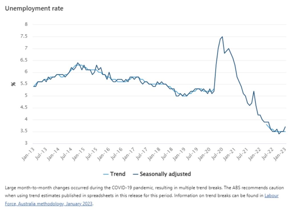
As we move through the charts, the contrast emerges. Our unemployment rate remained reasonably steady over the decade until the pandemic ravaged it. The rollercoaster ride that followed was a reflection of a few factors; mainly limited workers during a period of border closure, but also exacerbated by increased spending from savings following the lockdowns and an overall wealth effect. Our tight labour market has challenged policy-makers as the fight to combat inflation has clashed with higher employment levels.
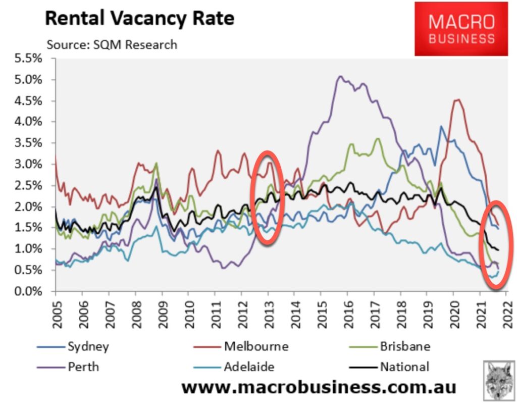
Our rental vacancy rates tell a story, and like some of the charts above, the change has been dramatic since the pandemic hit. The chart below shows a clear differential across the capital cities. Surprisingly, Melbourne remains the highest but the margin with other cities is tighter.
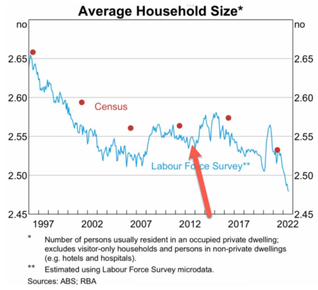
Rents are soaring due to a combination of factors including heightened migration numbers and lower rental stock supply. One that we don’t hear much about is average household size, though. The dissolution of relationships and a drop in the number of share house participants have also placed pressure on our supply/demand ratio for rental properties. The chart below shows the reduction of the average household size.
Last, but not least is this historic Westpac Consumer Sentiment Index graph. Back in 2013, following a downturn that spanned nearly two years, our consumer sentiment index sat at close to parity; 100%. Currently sitting almost as low as when the pandemic struck, our reduced sentiment counts for a lot.
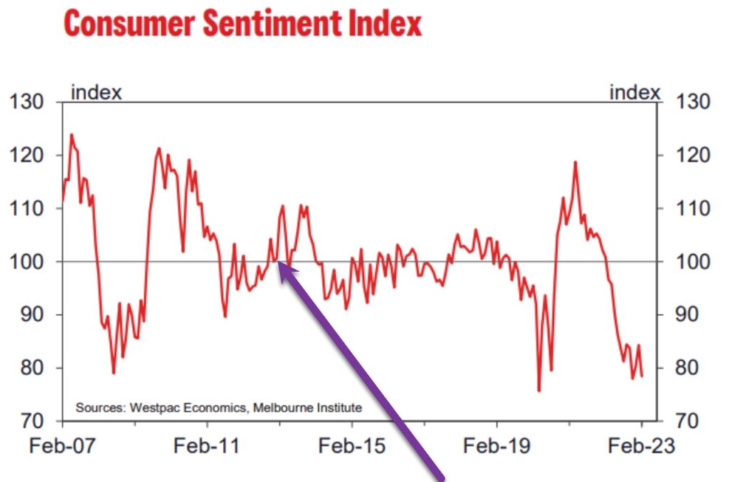
While there are many drivers of property markets, sentiment is palpable, and it’s significant when it comes to house price movements.
REGISTER TO OUR NEWSLETTER
INFORMATION
CONTACT US
1A/58 ANDERSON STREET,
YARRAVILLE VIC 3013
0422 638 362
03 7000 6026
CATE@CATEBAKOS.COM.AU
